Sales Performance Dashboard

*See interactive dashboard below
My data visualization journey started in early 2019 when I was introduced to Tableau through my then role. It was then I became addicted to the tool and was throwing all the .csv’s and SQL connections I could at the tool.
I quickly learned I needed to enhance my knowledge and skillset of the tool and data visualization practices, so I started searching for ways to do so.
One way I found was participating in Workout Wednesday’s, a weekly data visualization challenge published by a team of experts with exceptional knowledge and experience.
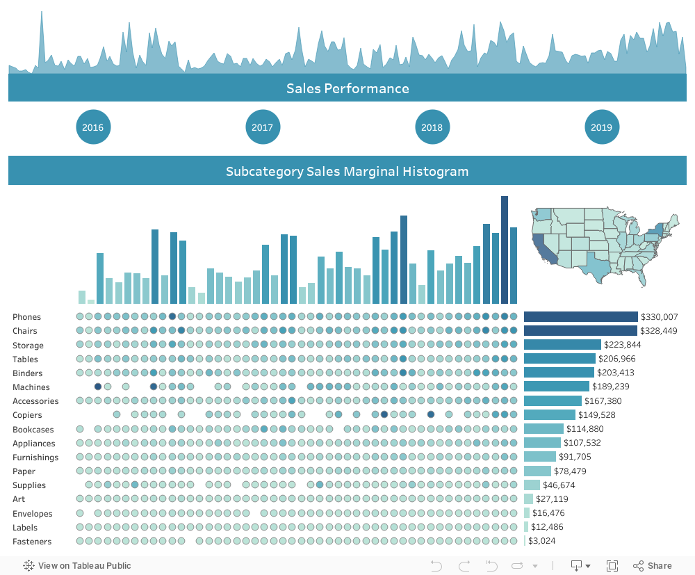
This visualization below is one of the first I did through these challenge, back in week 51 of 2019. The initial visualization, in which the challenge was to recreate it, can be seen here.
Even though I didn’t create this dashboard from scratch, I wanted to share it as I love the simple, yet useful design that display so much information in an easy to understand way. This challenge also required creating custom highlight actions that I think enhance the user experience and understanding even more, giving greater visibility to any object being hovered over or selected.
Check out more of my Tableau visualizations here on my Tableau Public page! And please comment below if you have any questions or thoughts!